
Prompt appearance and input
Preview and save one consistent prompt style across compatible mechanisms in your place.
Compare the three styles
Loading interactive previews…
Try each style with Background on and off. Drag Hold progress to inspect any point, or hold the test button for one second. The examples let you compare appearance and hold feedback.
Open Appearance
- Choose Style in the plugin headerThe appearance workspace opens independently of the selected object.
- Choose Style, Colors or InputThe live sample stays above the settings. Apply and Revert stay below them.
- Review, then Apply to placeAppearance changes affect compatible prompts across this place. Motion, links and card requirements stay separate.
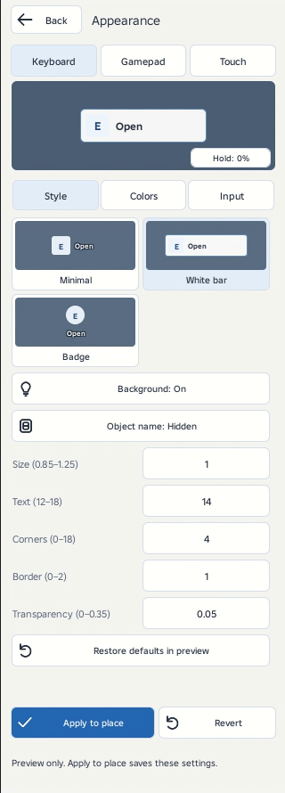
Style controls
| Control | What it changes |
|---|---|
| Minimal / White bar / Badge | Choose the layout shown above. Object names start hidden. |
| Background | On fills the entire panel during a hold. Off fills only the key, leaving the action text clear of any progress rectangle. |
| Object name | Shows the target name above the action. Use this when several nearby objects need distinguishing. |
| Size | Scales the whole control from 0.85 to 1.25. Touch keeps a key target of at least 44 pixels. |
| Text | Sets the base label size from 12 to 18. |
| Corners | Adjusts panel rounding from 0 to 18. The Badge key stays circular. |
| Border | Sets the panel outline from 0 to 2 pixels when its background is shown. |
| Transparency | Adjusts the panel and key background transparency from 0 to 0.35. |
| Restore defaults in preview | Returns the draft to Minimal and the default input settings. Apply is still required. |
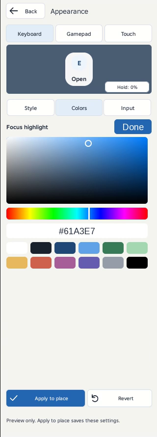
Colors and HEX
- Open Colors and click a swatchThe picker opens below the tabs. The live prompt stays visible.
- Choose the hue, then saturation and brightnessDrag the hue strip and the square, choose a palette color, or enter a six-digit HEX code.
- Choose Done, or another tabYour color remains in the preview draft. Apply to place saves it.
| Control | What it changes |
|---|---|
| Background | Panel color when Background is on. |
| Text | Action and optional object-name color. |
| Key fill | The key or circular badge surface. |
| Key text / glyph | The letter, controller symbol or Tap label. |
| Border | The outline of a visible panel. |
| Hold / focus | The progress fill during a hold and the focus accent. |
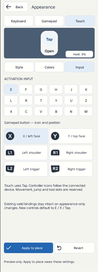
Input controls
| Control | What it changes |
|---|---|
| Keyboard | Choose E, F, G, H, J, K, L, R, T, Y, U, Z, X, C, V, B, N or M. Movement, jump, menu and numbered tool slots are excluded. |
| Gamepad | Choose X, Y, left/right shoulder or left/right trigger. Studio supplies the connected controller symbol, with a text fallback when unavailable. |
| Touch | Uses Tap. No keyboard letter is required. |
| Place-wide binding | Selecting a key or controller button sets a place-wide override. Appearance-only edits keep existing valid bindings when that override is off. |
Test your chosen input alongside other scripts in your game. Try the interaction with a controller before publishing.
Hold and preview controls
| Control | What it changes |
|---|---|
| Live sample | Click to switch between Open and Close. This does not operate a real object. |
| Hold: 0–100% | Inspect the fill at 0%, 25%, 50%, 75% and 100%. |
| Player use → Hold | Enables the actual hold requirement. Choose 1, 2 or 5 seconds, or enter 0.1–15 seconds. |
| Early release | Clears the fill without activating the mechanism. |
With Background off, the fill stays inside the key. With Background on, it follows the whole panel’s corners.
Save, discard and Undo
| Control | What it changes |
|---|---|
| Apply to place | Saves appearance and any selected input override in one Studio Undo step. |
| Revert | Discards the appearance draft and reloads the saved settings. |
| Back | Leaves the workspace without applying the draft. |
| Studio Undo / Redo | Restores the prior saved settings. If another edit changes them, reload before applying. |
See Appearance in Studio
A pinned preview
The sample remains visible while you edit. Hold progress belongs to the key when Background is off and the complete panel when it is on.
Independent changes
Style, Colors and Input have separate tabs. Apply to place saves the appearance. Revert discards the draft.